Designing a mobile app for coffee enthusiasts and home baristas

I believe that everyone can make a great cup of coffee if they have the right resources. There are so many moving parts that it can be overwhelming, especially if you are learning on your own, or just plain troublesome for the seasoned professional.
Bru is designed to assist coffee enthusiasts of all skills levels by providing tools and a knowledge sharing platform that are specifically-tailored to the coffee industry.
Objective
1. Design an end-to-end mobile app that helps coffee enthusiasts and home baristas in their brewing and learning process.
2. Create branding and visual elements for the app.
Client
Bru
Date
2021
Services
UX, UI, User Research
Team
Solo
01 Empathize
Who are the home baristas, how are they brewing, and what does their learning process look like?
During the COVID-19 pandemic in 2020 many of us picked up new hobbies to fill the time at home, perhaps to learn something new or to distract us from the feeling of impending doom.
One of those hobbies, I noticed amongst my personal network, was brewing coffee. And it made perfect sense, we could no longer go to coffee shops and enjoy our favorite brew.
People with disposable income also now had a lot of time on their hands and a lingering caffeine addiction. I thought to myself, how are they even learning how to brew coffee? As a former barista, I remember the training process to be quite intimidating and intense, albeit wonderful and rewarding.
I had friends messaging me for advice on all sorts of things from what grinder to purchase, how pour overs work, and so on.
So I set out to find out what are the biggest difficulties learning to brew coffee at home and how an app could potentially help. I did this through secondary analysis, competitive analysis, and user interviews.
Intentions
Discover how users currently brew their coffee
Discover how users currently keep track of their brews
Observe patterns in habits, pains, frustrations, and delights when it comes to brewing coffee
Tools
Secondary Analysis
Competitive analysis
User Interviews - 5 participants, 30 minute 1-on-1 interview over Zoom
Takeaways
People who brew coffee don’t use coffee-specific apps, but do gain knowledge from a variety of sources including baristas, Youtube, and other internet tutorials.
People don’t keep a strict log of their brews but rather take a more casual approach to learning, adjusting parameters one-by-one, day-by-day.
Visual learning is the number one priority as well as quick and easy resources.
There are too many resources out there and no easy way of telling what is best for you (lack of context and specificity).

Competitive analysis
Initially, I was focused on tracking your learning process but researched proved that to be not an important aspect of learning how to brew coffee.
Finding the right resource and validating your result seemed to be the main pain points when learning how to brew coffee.
To better picture and empathize with the user, I created a persona, Mintra, who is an aggregate of my user interview participants.

User Persona
By creating an empathy map, I discovered that while Mintra is enjoying her coffee journey and is excited to learn more, the amount and variety of resources is overwhelming.
How does she know she's doing things correctly and tasting what she's supposed to taste? Without proper guidance (such as a barista friend) Mintra could use some help.

Empathy Map
02 Define
Here, I define the user, the problem space, and our scope within it. Similar to Mintra, the average Bru user has at least some coffee knowledge but much to learn.
POV Statement: Mintra, a budding at-home barista, needs to brew a consistently tasty cup of coffee so that she feels reassured in her skill and knowledge progression.
HMW Statement: How might we help Mintra validate the result of her brews so that she can brew a consistently tasty cup of coffee?
My Solution: When learning how to brew coffee, you also learn how to taste coffee. Bru focuses on precision to help the user develop their palate as they discover and use new recipes.
03 Ideate
Methodology
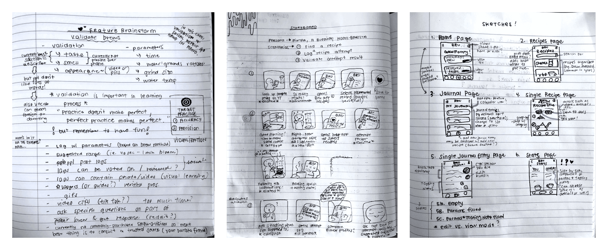
First, I brainstormed a solution by breaking down what it means to validate a brew as well as important parameters to handle when brewing coffee. This information came directly from user interviews.
Roughly, the process can be broken down into 3 steps - finding a recipe, creating a journal entry from that recipe, and comparing that journal entry to a goal or target "correct" result (this was difficult to tackle because taste is often subjective).
A storyboard was used to better visualize the app being used in real life.Next, I brainstormed features and created a prioritization matrix to select the best ones.
Once key features were decided upon, I further developed the solution by creating task flows based on the rough process in step 1.
I then combined the task flows into a user flow to show how they are interconnected and to include user context.
With a solid idea of how this app would work, I began the design process by sketching key pages on paper.
I created a user flow in order to make sure all steps make sense in sequential order and have multiple entry and exit points depending on what the user is trying to do when opening the app at that time. This is the expected, most direct flow, which was tested in usability testing.
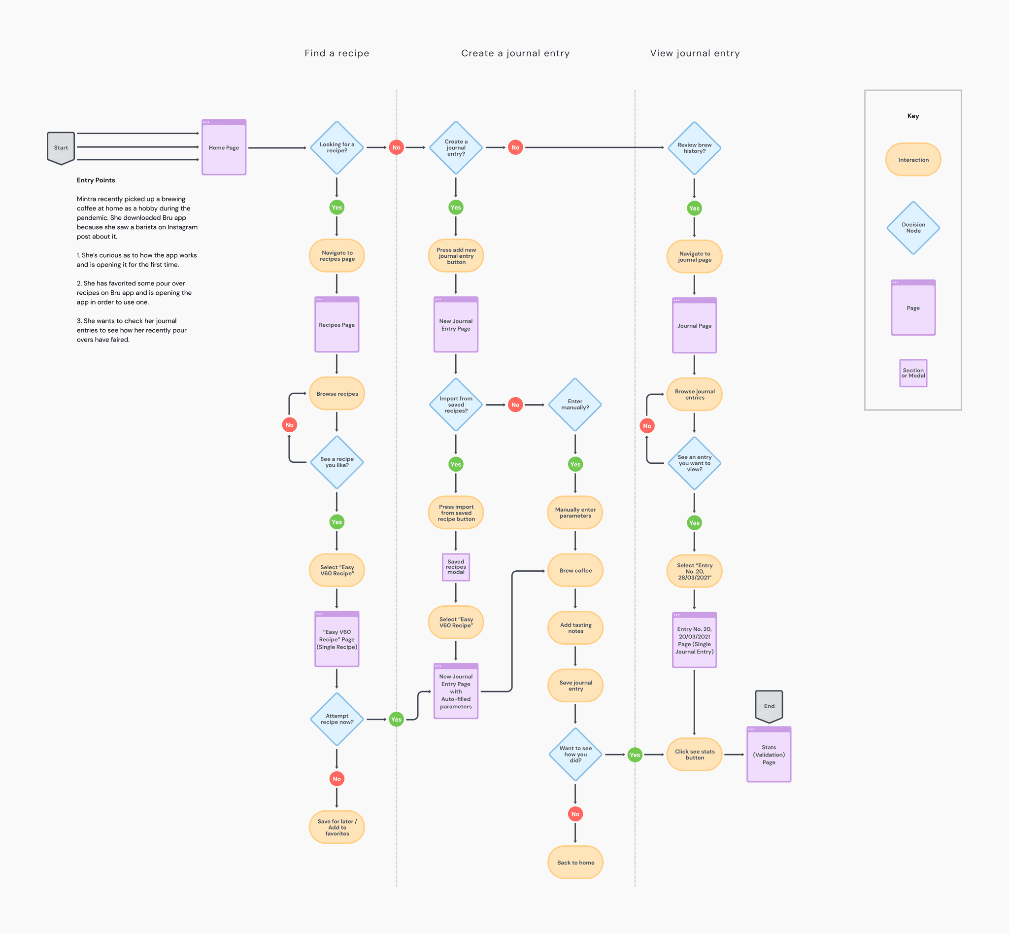
User Flow
04 Wireframing
So how does Bru help home baristas like Mintra get more consistent results?
When learning how to brew coffee, you also learn how to taste coffee. Bru focuses on precision to help the user develop their palate as they discover and use new recipes.
Without a trained barista next to you it's difficult to confirm what you're tasting (accuracy). But even solo, this app helps you spot trends by logging tastes with suggested keywords, and providing tips on why you might be tasting what you are tasting and tips on how to adjust accordingly.
I tried to make it clear that even though you tasted something different than the target brew it's not necessarily wrong. I did this with friendly tone, neutral wording, and no numerical score.
The target brew is calculated using flavor notes from the roasters themselves as well as other users, making this both a training and future social app.
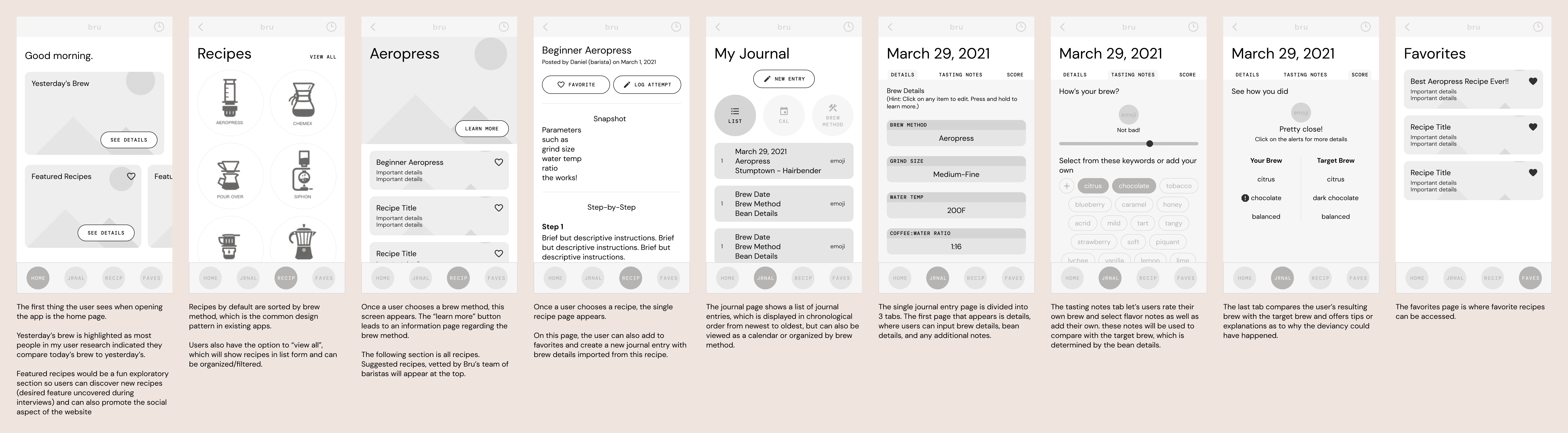
Medium-fidelity wireframes of key screens
05 Test
Before spending time on UI elements, I tested my medium-fidelity wireframe. Since this is a niche app with a unique concept (my market research found no existing coffee brewing apps with these features), I wanted to ensure that it makes sense.
What I learned
Intentions
Test main task flows - finding a recipe, creating a new journal entry, validating tasting notes ("score")
Are components consistent and intuitive?
Observe any difficulties, confusion, or frustration.
Does the user understand the validating feature and find it interesting, usable, and useful?
Tools
Moderated usability test via Zoom, 4 participants
Takeaways
Participants desire ample visuals in recipes and a friendly approach when it comes to validation (do not make them feel bad).
All participants understood the recipe finding feature in its entirety while 3 out of 4 participants understood the journal and validation portion. Those participants also found the keyword selection feature particularly delightful.
Some iconography or vocabulary were confusing, such as the timer icon and "log attempt" button. Comprehension of vocabulary varied with users' self-reported skill level.
There was no general consensus on important details or parameters to include when previewing recipes.
06 Visual Design
Bru's brand attributes are modern, casual, fun, and also artisanal.
In user interviews, multiple participants expressed aesthetics as an important factor when choosing coffee equipment or brands to align with.
Contrary to that, most existing apps in this field are lacking in aesthetics. Bru's branding aims to fulfill the need for a product that not only works, but is also aesthetically pleasing.
The modern greyscale tones with ample white space was inspired by popular coffee scale brand, Acaia.
Orange was chosen as the brand color as warm tones convey friendliness; it also represents the sunrise (many people drink coffee in the morning).
Word usage and tone remains casual while terminology is industry-specific and often technical. This allows the user learn proper techniques while feeling like they are being coached by a knowledgable barista friend, not a piece of metal.

Style Guide
07 Prototype
Finding a recipe
Creating a new journal entry
Assessing a previous journal entry and comparing results with target brew
08 Lessons Learned and Next Steps
Lessons Learned
This was my most difficult project to date as the problem space is quite niche and the solution I came upon (validation of brew) is based on something that can be quite subjective.
Coffee is a personal passion of mine and seeing the positive reactions to my app from both strangers during testing and peers, I am now looking into getting this app developed. As a former barista and coffee enthusiast, I find great enjoyment in helping others improve their skills. Who knows? Maybe Bru will be coming to an app store near you!
Next Steps
Test high-fidelity prototype. Is the branding fun and casual as intended or is it too much, seeming childish or lessening the legitimacy of the app's contents?
Look into features from matrix not designed, specifically social aspects.
Add help buttons or perhaps a glossary of terminology for newer users.
Add feature for unit conversions.